| >> |
01/28/12(Sat)11:05 No.1503430
File1327766750.jpg-(213 KB, 880x692, 1327764992502.jpg)
 >>1503416
I loled at this. there is little composition here and your comments on color theory are really reaching.
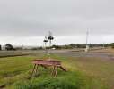
>The rusted railway barrier is lined up with the crossing signs above it
you centered your subject and there are some centered things above it
>the road and rail lines extending outwards in a shallow 'X' formation
that's
really reaching too. the "x" is not deliberate enough, or strongly
emphasized enough to cite as a compositional element. basically, it
doesn't look like you intended to do it regardless of whether you were
thinking about it while shooting or not. plus it's not much of an x
anyways, the road turns at the rail, or at least, you didn't choose the
perspective that would make it appear as a continuous line.
>The
tree entering the frame on the left is carefully balanced by the power
line at an equivalent position on the right hand side
that's just bat shit retarded. the tree is cut off, the power line is not balancing anything except maybe the yield sign.
the
horizon is too close to the middle, also, it isn't level. the diagonal
in the foreground is weak. there are too many distracting elements that
do nothing, like the car and the wooden rails - and the foreground grass
is way too prominent. if you're trying to tell a story about a rail
ending and another one continuing, you really missed it with this
composition. there are too many competing subjects in the picture and
you did a very poor job framing.
>The
problem is that the photography most people are used to is much more
in-your-face with its contrast and colours - it's so *obvious*.
i'd
rather my shots be obvious than completely nebulous and fucktardedly
pretentious. your shot is purely documentary. it looks like you took it
for an insurance claim or something.
EXIF data available. Click here to show/hide.
| Camera-Specific Properties: | | | | Image-Specific Properties: | | |
|


