Posting mode: Reply
[Return]
Name
E-mail
Subject
Comment
Verification
reCAPTCHA challenge image
Get a new challenge Get an audio challengeGet a visual challenge Help
File
Password(Password used for file deletion)
  • Supported file types are: GIF, JPG, PNG
  • Maximum file size allowed is 5120 KB.
  • Images greater than 250x250 pixels will be thumbnailed.
  • Read the rules and FAQ before posting.
  • このサイトについて - 翻訳


  • File : 1326703739.jpg-(180 KB, 584x834, depth2.jpg)
    180 KB Digital Darkroom Challenge 10: Depth Photoshop® !DahGayseXY 01/16/12(Mon)03:48 No.1491474  
    Because of the recent depth processing thread, I thought it might be a good time for a digital darkroom challenge about enhancing the depth/atmospheric perspective in a shot. I'll critique people's images who ask for it. The last few times I've gotten overwhelmed by all the crits I needed to give out, thus the new "ask for crit" rule. For those unfamiliar with the way I generally crit these, I try to do it from the perspective of a commercial editor. If it looks like it's had obvious post processing done, it'll generally be rejected.

    I'm also going to be something that I'm dreading (it'll make lots of people unhappy/frustrated) but I'm going to do it because it will help you in the long run, even if you hate me now. I will rate each posted retouch either "improved from original" or "original was better." Getting "improved from original" is actually MUCH MUCH harder than you'd think. The moment one of your changes goes a little too far, you'll fall into "original was better" even if you spent five hours on the retouch where everything else looks great. It's very, very easy to make the image overall worse if you're not careful. Even those who do not request a critique will be rated, and I'll try to mention the issue that's the biggest problem.

    raw: http://www.mediafire.com/?1udb1k5k5dx2bj0
    No jpeg this time - I want to deal with a more advanced crowd. I've attached my retouch. You may find it helpful to check your progress against my retouch every so often, it may save you from going in a bad direction or give you ideas/inspiration.
    EXIF data available. Click here to show/hide.
    >> Photoshop® !DahGayseXY 01/16/12(Mon)03:50 No.1491477
    Some suggestions I have for an image like this:
    - try to do the bulk of the color toning and getting the values of the image where you want them during the raw conversion
    - keep the contrast soft, don't crush the blacks of blow out the whites unless you do it really well
    - first select the model and save the selection as you'll be needing to select the background and the model many times in a retouch where you push the depth
    - look up "atmospheric perspective" or "aerial perspective" for more tips
    - keep the transitions soft (I guess this goes with soft contrast)
    - keep saturation gentle on the eyes
    - make changes that improve the composition rather than changes because you think they look better
    - use contrast, saturation, and level of detail to guide the eye
    - if you want to try something risky/stuff that's the opposite of what I'm saying, go right ahead - I hope you're successful as I'll probably learn something from you, but just be warned that it's very easy to get "original was better" if you try something extreme and don't have the skill/experience to pull it off

    Aim for an image you could see in a magazine. If you're paranoid about giving out free retouching you can watermark. Don't forget to resize to 1000 px at the longest, and remember that you have to ask for a crit if you want more feedback than "improved" or "original was better." Finally just because you might get "original was better" doesn't mean you failed, it just means you learned about a processing weakness you have. Don't get discouraged! If you get "improved" then you are either a very skilled retoucher or a retoucher who's developed restraint.
    >> Anonymous 01/16/12(Mon)04:48 No.1491503
         File1326707295.jpg-(338 KB, 667x1000, schloppy.jpg)
    338 KB
    I thought this was a pretty funny challenge, didn't have much time though, so this is a sloppy attempt. Not paths here, all eraser and lasso tool. Mostly eraser...
    Had I more time I'd probably do something about that gate.
    I'll do a new one later.
    EXIF data available. Click here to show/hide.
    >> nouveau 01/16/12(Mon)07:39 No.1491577
         File1326717597.jpg-(349 KB, 536x695, _W1Z1229 (12) resize.jpg)
    349 KB
    Would love some crit on this, as I used a bit of time on this.

    I'll be the first to admit; I am not good at masking, and I was having a bit of trouble with masking out the hair/making it look right.. and I still think it looks a little bit off.

    - and it was hard to find a background I thought would fit, but ended up using a picture I have taken myself.

    So yeah, here's my attempt.
    EXIF data available. Click here to show/hide.
    >> Anonymous 01/16/12(Mon)07:43 No.1491581
    >>1491577
    for some reason she appears to be floating
    >> Anonymous 01/16/12(Mon)07:59 No.1491583
    >>1491577
    there's an arc above her head
    >> Miki !nSmsPBWyaY 01/16/12(Mon)08:11 No.1491590
         File1326719510.jpg-(190 KB, 667x1000, _W1Z1229-as-Smart-Object-1.jpg)
    190 KB
    >> Miki !nSmsPBWyaY 01/16/12(Mon)08:15 No.1491593
         File1326719756.jpg-(178 KB, 667x1000, _W1Z1229-as-Smart-Object-12.jpg)
    178 KB
    >>1491590
    Maybe a bit too much contrast idk.
    >> brotein !shake/MwVs 01/16/12(Mon)08:17 No.1491596
         File1326719850.jpg-(484 KB, 667x1000, _W1Z1229.jpg)
    484 KB
    Best I can do. I formally request a critique, my good fellow.

    Also,

    >Try to use Photoshop®'s as a guide
    >Inevitably just end up with a shittier copy of it

    Oh well.
    >> Anonymous 01/16/12(Mon)08:40 No.1491605
         File1326721240.jpg-(193 KB, 575x834, 1326703739810.jpg)
    193 KB
    My attempt
    EXIF data available. Click here to show/hide.
    >> Anonymous 01/16/12(Mon)08:46 No.1491611
         File1326721586.jpg-(456 KB, 1000x1078, _W1Z1229.jpg)
    456 KB
    Throw in the towel, you homos. I have beaten you.
    >> Anonymous 01/16/12(Mon)08:52 No.1491616
    >>1491477
    >- first select the model and save the selection as you'll be needing to select the background and the model many times in a retouch where you push the depth

    I don't know what you mean by this, could you explain?
    >> Anonymous 01/16/12(Mon)09:08 No.1491631
         File1326722922.jpg-(235 KB, 1168x834, fixd.jpg)
    235 KB
    The original is not better.
    EXIF data available. Click here to show/hide.
    >> Mine is de best 01/16/12(Mon)09:12 No.1491634
         File1326723120.jpg-(376 KB, 584x834, 1.jpg)
    376 KB
    Mine is de best
    EXIF data available. Click here to show/hide.
    >> Anonymous 01/16/12(Mon)09:14 No.1491636
         File1326723279.jpg-(797 KB, 667x1000, mehcolor.jpg)
    797 KB
    I oversaturate too much. I would really like to know how to get a more natural and smoother look. I really like the way noveau edits.
    >> Anonymous 01/16/12(Mon)09:15 No.1491637
    >>1491616
    It means you need to work on the background seperate form the girl. You make your selection with one of selection tools or you use paths in potatoshop (next to "layers" there is a tab called "paths" select, new path, use pen tool (p) to carve out a path that you can activate as a selection. Paths are the way to go, IMO)

    When the model is selected (just inverse the selection), you can work on the background independently of her, not fucking her up in the process.

    Google aerial perspective.
    >> Anonymous 01/16/12(Mon)09:15 No.1491638
         File1326723329.jpg-(464 KB, 667x1000, mehbw.jpg)
    464 KB
    >>1491636
    b/w
    >> Anonymous 01/16/12(Mon)09:15 No.1491639
    >>1491636
    wat? Is your monitor out of wack?
    >> Anonymous 01/16/12(Mon)09:18 No.1491643
    >>1491639
    yeah i am actually using a cheap as shit old tn panel :V
    >> Anonymous 01/16/12(Mon)09:18 No.1491644
    all of these are awful :S
    >> Anonymous 01/16/12(Mon)09:23 No.1491646
    >>1491637
    got it, thanks
    >> Anonymous 01/16/12(Mon)09:23 No.1491647
    in my opinion the picture doesnt need any retouching

    photoshops edit looks nice but the yellows look really "dusty" and thus "not fresh"
    >> Anonymous 01/16/12(Mon)09:24 No.1491648
    >>1491636
    i don't understand, if you know this is terrible, why can't you stop yourself from being terrible?
    >> Anonymous 01/16/12(Mon)09:29 No.1491651
         File1326724170.jpg-(770 KB, 680x1000, _W1Z1229.jpg)
    770 KB

    EXIF data available. Click here to show/hide.
    >> Anonymous 01/16/12(Mon)09:29 No.1491652
    >>1491636
    >Selective Color tool
    >Blacks -10
    >Whites +10
    >> Anonymous 01/16/12(Mon)09:42 No.1491670
    >>1491503
    Nice
    >>1491593
    Nice, a bit dead on the colours? Contrasts and highlights are gone.
    >> Anonymous 01/16/12(Mon)09:48 No.1491673
         File1326725298.jpg-(756 KB, 667x1000, asfsdfsdf.jpg)
    756 KB

    EXIF data available. Click here to show/hide.
    >> Anonymous 01/16/12(Mon)09:49 No.1491675
    Gah, what are you fuckers doing to the colors? Yellow/Reddish all of them, aspire NOT to have a color tint in your pictures, it looks awful. Like an early Nikon digital.
    >> Anonymous 01/16/12(Mon)09:49 No.1491676
    PHOTOSHOP U ASSHOLE HOW DID YOU MANAGE TO FIX THOSE PROPORTIONS SO FUCKING NICELY.

    Fucking couldn't do it, I hate PS right now and Photoshop, too, for beeing too good.
    >> Anonymous 01/16/12(Mon)09:55 No.1491678
         File1326725741.png-(845 KB, 566x831, welp.png)
    845 KB
    shit man I dont think I've ever even shot portraits
    >> Anonymous 01/16/12(Mon)10:12 No.1491685
         File1326726768.jpg-(272 KB, 667x1000, toodeep.jpg)
    272 KB
    Kind of rushed it. I'm open to criticism..
    EXIF data available. Click here to show/hide.
    >> Anonymous 01/16/12(Mon)11:07 No.1491725
         File1326730031.jpg-(532 KB, 683x1000, RetoucheDepth.jpg)
    532 KB
    Critique would be greatly appreciated.
    EXIF data available. Click here to show/hide.
    >> Anonymous 01/16/12(Mon)11:08 No.1491727
         File1326730123.jpg-(697 KB, 667x1000, _W1Z1229.jpg)
    697 KB
    asking for crit
    EXIF data available. Click here to show/hide.
    >> Anonymous 01/16/12(Mon)11:11 No.1491729
         File1326730270.jpg-(238 KB, 800x1000, out.jpg)
    238 KB
    quit with the unsharp mask people
    >>1491651
    >>1491638
    these are the only decent ones
    >> Anonymous 01/16/12(Mon)11:23 No.1491736
         File1326730991.jpg-(525 KB, 667x1000, rawedit.jpg)
    525 KB
    gave it a shot, lemme know how ya like it

    >>1491729
    mr color cast giving other people a hard time
    EXIF data available. Click here to show/hide.
    >> Anonymous 01/16/12(Mon)11:27 No.1491741
    >>1491729
    Yours is purple and you suck.
    >> Anonymous 01/16/12(Mon)11:31 No.1491744
    >>1491736
    where is the contrast at?
    >> Anonymous 01/16/12(Mon)11:32 No.1491747
    photoshop you faggot where are you?

    give us noobs some tips and tell us which you like the most
    >> Anonymous 01/16/12(Mon)11:43 No.1491753
    >>1491736
    >color cast
    >not arty as fuck
    >> Anonymous 01/16/12(Mon)12:30 No.1491791
         File1326735056.jpg-(571 KB, 1024x1536, MySubmission.jpg)
    571 KB
    This is my B&W attempt. Might try colour later. Would love criticism.
    EXIF data available. Click here to show/hide.
    >> Anonymous 01/16/12(Mon)12:32 No.1491793
    >>1491791
    >faux film grain
    >laughinggirls.flac
    >> Anonymous 01/16/12(Mon)12:49 No.1491805
    >>1491793
    >2012
    >jellyness
    >> Anonymous 01/16/12(Mon)12:49 No.1491806
         File1326736199.jpg-(394 KB, 800x800, _W1Z1229-2.jpg)
    394 KB
    my sepia / B&W attempt.
    would like to hear some critique
    EXIF data available. Click here to show/hide.
    >> themute !ljxf6.COKE 01/16/12(Mon)12:54 No.1491808
         File1326736458.jpg-(441 KB, 600x900, _W1Z1229-1.jpg)
    441 KB
    > baaaaaaaaaam!
    EXIF data available. Click here to show/hide.
    >> HCB 01/16/12(Mon)12:59 No.1491811
         File1326736781.jpg-(620 KB, 667x1000, _W1Z1229 edit 1.jpg)
    620 KB

    EXIF data available. Click here to show/hide.
    >> Anonymous 01/16/12(Mon)13:03 No.1491814
    >>1491729
    best imo
    >> Anonymous 01/16/12(Mon)13:08 No.1491816
    >>1491808
    That yellow makes me hard.
    >> Anonymous 01/16/12(Mon)13:10 No.1491818
    >>1491793

    I don't know, I used the built-in grain feature in ACR, then exagerated it a bit more with smart sharpening filters. What is the problem exactly?
    >> Anonymous 01/16/12(Mon)13:16 No.1491822
    >I try to do it from the perspective of a commercial editor. If it looks like it's had obvious post processing done, it'll generally be rejected.

    good job keeping your edits subtle /p/ :D
    >> Anonymous 01/16/12(Mon)13:27 No.1491823
    >>1491822

    Is it assumed that the editor hasn't seen the actual photo?
    >> Anonymous 01/16/12(Mon)13:33 No.1491824
         File1326738819.jpg-(4.23 MB, 2336x2336, tiim.jpg)
    4.23 MB
    my turn.
    crit me hard
    >> Anonymous 01/16/12(Mon)13:43 No.1491830
         File1326739384.jpg-(219 KB, 666x1000, girl.jpg)
    219 KB

    EXIF data available. Click here to show/hide.
    >> Anonymous 01/16/12(Mon)14:02 No.1491846
    >>1491577
    This is my favorite -- it reminds me of those silly/fun Bavarian soft-core porn videos from the 70's
    They were called Leiderhosen, or something like that.. I don't speak German :(
    >> Anonymous 01/16/12(Mon)14:06 No.1491847
    where can I get sum cool free presets for LR?
    >> Anonymous 01/16/12(Mon)14:13 No.1491850
    >>1491824

    would
    >> Jokke_r !darIyNTbjA 01/16/12(Mon)14:48 No.1491874
         File1326743299.jpg-(613 KB, 667x1000, _W1Z1229 as Smart Object-2.jpg)
    613 KB
    Not really sure if this qualifies as "depth" But i like it, looks natural :/
    EXIF data available. Click here to show/hide.
    >> Anonymous 01/16/12(Mon)15:27 No.1491899
    >>1491678
    What actions did you do on PS?
    >> SgtKashim !rZedm.A/cg 01/16/12(Mon)16:35 No.1491960
         File1326749705.jpg-(338 KB, 1000x1500, _W1Z1229-1-2e.jpg)
    338 KB
    Interesting...
    I rather like this one.
    EXIF data available. Click here to show/hide.
    >> Jokke_r !darIyNTbjA 01/16/12(Mon)17:07 No.1492001
         File1326751643.jpg-(670 KB, 667x1000, _W1Z1229 as Smart Object-3.jpg)
    670 KB
    >>1491874

    slight variation.
    EXIF data available. Click here to show/hide.
    >> Gerhart !!Er2kRZDPVFx 01/16/12(Mon)17:08 No.1492005
         File1326751715.jpg-(2.07 MB, 2000x1500, Athmospheric-perspective-chall(...).jpg)
    2.07 MB
    Here's my take at it.

    Since I've spend a little time on it, I would like some C&C Photoshop, especially on the perspective thing you suggested.
    >> HCB 01/16/12(Mon)17:44 No.1492053
    >>1491874
    good job on that one, is that vignetting around the edges?
    >> Jokke_r !darIyNTbjA 01/16/12(Mon)17:50 No.1492059
    >>1492053

    Yeah i added a tiny bit of vignetting in ACR in order to pull the eye towards the subject in the center. Then i did some further masked curve/contrast adjustments on the body, face and eyes to se them apart from the background a bit.
    >> Photoshop® !DahGayseXY 01/16/12(Mon)18:23 No.1492095
         File1326756213.jpg-(262 KB, 667x1000, _W1Z1229-as-Smart-Object-1.jpg)
    262 KB
    Great job to all those who participated thus far, both for actually completing the retouch and for posting it here for critique. I show 73 downloads so far, so the rest either gave up or aren't brave enough to post theirs. I do notice that the majority of them are going to get "original was better" rating (I've got to think up something more creative wording for that), but don't let that discourage you. It just means one of the changes you made overwhelmed the image. Also when I say "original was better," I'm not only talking about from the imaginary editors perspective (will this image be commercially useful), but also my opinion from a more artistic perspective (considering composition, mood...ect).

    The original which I've attached isn't a bad image at all and just needs a few basic tweaks here and there. I'm going to list off the things I immediately thought when viewing the image for the first time in the following post. After that I'll critique my retouch (which is far from perfect), then jump into giving feedback and critiques on the rest of them.
    EXIF data available. Click here to show/hide.
    >> Anonymous 01/16/12(Mon)18:26 No.1492100
         File1326756407.jpg-(571 KB, 667x1000, _W1Z1229 lrps.jpg)
    571 KB

    EXIF data available. Click here to show/hide.
    >> Photoshop® !DahGayseXY 01/16/12(Mon)18:27 No.1492101
         File1326756440.jpg-(337 KB, 1920x1200, 1303831692794.jpg)
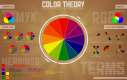
    337 KB
    Before I start, there's some theory I'd like to go over that I see many of you aren't familiar with. Until you've confirmed that you have a good "eye" for dramatic changes by asking professional photographers and retouchers what they think of your processing (best way is industry critique forums), DO NOT MAKE DRAMATIC CHANGES BECAUSE YOU THINK IT LOOKS GOOD!! You can't trust your perception of the changes. So if you can't use "let's make this look good" as a mindset for retouching, what do you do? Think
    "how can I improve the COMPOSITION of the image" - this includes the bulk of the changes such cleaning up visual snags, distracting values, cropping, sharpening, and d&b
    "how can I make the photographer's message more clear"
    "how can I improve the illusion of DEPTH in this image?"
    "what mood is this image supposed to elicit? How can I use color and contrast to enhance the mood?"
    And finally "if it isn't broken, don't fix it" aka "don't make changes just because you can"

    I see so many of the retouches in this thread have really ruined the image by doing some weird sharpening or other non-necessary stuff, which is totally normal. I must have ruined hundreds of images before I started getting critiqued by professionals and learning when to make a change because "it looks good." The more comfortable you are with composition, color theory, and art theory in general, the more you can start to trust your perception of what looks good. I'm still frequently making horrible decisions in retouching, but luckily I know lots of other really high end retouchers who help me out by telling me when I suck.
    >> Photoshop® !DahGayseXY 01/16/12(Mon)18:35 No.1492113
         File1326756916.jpg-(44 KB, 503x429, relcolor.jpg)
    44 KB
    Good composition resources:
    http://www.androidblues.com/visualperception.html
    http://itchstudios.com/psg/art_tut.htm
    http://thepiratebay.org/torrent/5831706
    http://www.scribd.com/doc/15795696/If-Its-Purple-Someones-Gonna-Die-The-Power-of-Color-in-Visual-Sto
    rytelling
    http://www.worth1000.com/tutorials/161809/camera-skills-a-guide-to-photographic-composition
    http://www.worth1000.com/tutorials/161642/theory-breaking-the-rules
    http://www.worth1000.com/tutorials/161595/color-theory

    • image is a little bit warm, which may suit the image in the end, but the shadows or highlights will need either slight color toning or desaturation to make it look more intentional and not like a color cast
    • scarf and gloves are much to saturated compared to the rest of the image, there's some blown information on the top glove. The way the image reads now, the scarf and gloves are the focal point
    • whispy hairs are a little bit annoying, but they're unified enough that they don't grab my attention too bad. Also they show the wind, without them the clumps of hair that are blowing slightly would look strange. Repairing the wispy hairs would require also changing the blowing clumps, so I didn't want to bother. If you went for it, great job. Fixing that hair in a way that looks real would definitely add to the image.
    • the darkest parts of the image are in her jacket, so I know I'll be lightening some of those areas a little and darkening some of the blacks in her face
    • overall color harmony for the image feels kind of ugly, I'll try to reduce the overall color variety and find something that elicits a mood
    • face/eyes need sharpening
    • d&b texture unification needed on face, and the blush on the right side is looking to dark compared to the left
    >> Photoshop® !DahGayseXY 01/16/12(Mon)18:50 No.1492132
         File1326757859.jpg-(386 KB, 1168x834, depth2comp.jpg)
    386 KB
    Objective critique of my retouch (attached before/after):
    • like >>1491647 said, I made the scarf look dusty and unappealing. I also failed to repair that blown spot on the top glove
    • the reds in the jacket are still saturated enough that they draw attention from the model's face
    • the fence is a little distracting, it's too sharp and it cuts through a simple area which makes it stand out more
    • the saturation/hue of the grass in the foreground looks a little strange
    • was a cool mood the right idea? Maybe I should have worked with the warmth and tweak her expression to be a little happier, or do a muted warm.
    • button draws my eye a bit

    >>1491503 ORIGINAL WAS BETTER
    Everythings about three times as extreme as it needs to be. My eye is attracted to the bottom left of the image, then it wants to escape. Background is too white/foggy for how contrasty the model is. Slight halo around head.
    EXIF data available. Click here to show/hide.
    >> NatureGuy !!tg3hbUo06u8 01/16/12(Mon)18:51 No.1492134
    these are always a lot of fun
    >> NatureGuy !!tg3hbUo06u8 01/16/12(Mon)18:51 No.1492136
         File1326757904.jpg-(557 KB, 667x1000, _W1Z1229.jpg)
    557 KB
    forgot image
    EXIF data available. Click here to show/hide.
    >> Photoshop® !DahGayseXY 01/16/12(Mon)18:54 No.1492140
    >>1491577 IMPROVEMENT OVER ORIGINAL
    Haha, nice try on the hair. Props for the effort. It just baaaarely was good enough looking to qualify for the "improvement over original" grade. The overall color harmony is very appealing, maybe I'd reduce the vibrance of the gloves/scarf slightly or tweak the hue as it seems to stand out as a little unnatural in the scene. Good job placing her in the scene, but I'd put her a little higher. I think the background is sloping down to the distance, and it looks like the grass in the foreground goes up to her thigh. Because it's such a bright scene I'd lighten her midtones a little. She seems just a little dense for the scene. Awesome changes to her bone structure. I didn't even notice until I was almost done with the crit. That's a pretty dramatic change too.

    There are a couple blurred white objects in the distance that I can't figure out. I'd clone them. You brought the saturation up to a level that's borderline too much, personally I would have reduced it a bit, but it does work- just barely. The saturated reds in her jacket are REALLY intense, and they draw my eye from the the composition a bit. Besides all that, very nice work. The overall composition is very nice. My eyes had a very nice time traveling through your image. You picked a mood and your changes to the image all reflect that mood.
    >> Photoshop® !DahGayseXY 01/16/12(Mon)18:55 No.1492143
    I've got to work on a job now, be back later to crit more of them. If you posted your retouch but now feel like you want to change it (happens to me like every time), then just post the update and quote the original post. I'll only pay attention to the newest version.
    >> Anonymous 01/16/12(Mon)19:05 No.1492152
    I actually thought the jpeg posted in OP was unedited. It's so boring and bland. The picture all in all is a poor starting point, so I gues you can't rally bitch at anyones effort. you can't polish a turd that much.

    The mood in the image is "girl looking at cows and letting them out of their pasture in a rural setting with slight breeze but not really cold, in spite of her wearing gloves she doesn't want to close her coat, maybe it's open for aesthetic reasons but if she was so bothered she would have worked more on that makeup"
    To me the original image is a picture of a gate, accidentally, there is a girl in it. Either use the gate or lose it. I hate that gate.

    As for the edits, each and every one is pretty bad, nothing too grotesque, but I'd be surprised to find something like this in a magazine, actually, 1. because the image is pretty crap, 2. because the op edit just isn't one I see, not even photojournalists would postprocess this little. It looks like "Ava Sings Songs From The Old Country"-cover. One thing I love though is that she doesn't have atomic mutation eyes on any of them. No glowing nuclear eyes of hate, which I see on covers of magazines all the time.
    >> Anonymous 01/16/12(Mon)19:18 No.1492171
         File1326759514.jpg-(191 KB, 1500x1720, care.package.jpg)
    191 KB
    Hey /g/, I came here looking for advice.

    The programming part of my first year of university is going great (Electronic Engineering). Dealt extremely well with C during my module, which just finished and also the PIC programming is going extremely well. So my question is, which programming language should I take to continue developing and avoid losing my momentum.


    also fuck this developers shit
    EXIF data available. Click here to show/hide.
    >> Anonymous 01/16/12(Mon)19:30 No.1492180
    >>1492171
    < /g/ is that way, sir.
    >> Photoshop® !DahGayseXY 01/16/12(Mon)19:30 No.1492181
         File1326760225.jpg-(52 KB, 479x358, 1325535060396.jpg)
    52 KB
    >>1492152 The mood in the image is "girl looking at cows and letting them out of their pasture in a rural setting with slight breeze but not really cold, in spite of her wearing gloves she doesn't want to close her coat, maybe it's open for aesthetic reasons but if she was so bothered she would have worked more on that makeup"
    Looks like someone doesn't know the difference between mood and narrative.

    I'm aware this image isn't magazine quality. It was the best image in my "practice raw" folder for the purposes of this thread, which apparently you didn't understand. The first is practicing how to push the depth in an image, the second is practicing deciding on a mood and having the changes you make to the image support that initial decision, and the third is ending up with processing similar to the processing that's done in magazines. Once you're comfortable with that, you can apply it to turds and masterpieces alike.

    If you'd like to donate a magazine quality image for the next digital darkroom challenge, send it to photoshopanon@gmail.com, but I somehow have the feeling you've never been anywhere near the production of a quality commercial photo.
    >> SgtKashim !rZedm.A/cg 01/16/12(Mon)19:34 No.1492182
         File1326760490.jpg-(256 KB, 882x1258, _W1Z1229-1-2vec.jpg)
    256 KB
    I had fun with this. Decided it really does need the vignette to get a good depth feeling. Went a bit more vibrant direction than Op, too.

    Would love some C&C. :)
    EXIF data available. Click here to show/hide.
    >> Photoshop® !DahGayseXY 01/16/12(Mon)19:37 No.1492186
    >>1492152
    Actually your confusion is my fault after-all. Instead of saying "aim for an image you could see in a magazine", I should have said "aim for processing you could see in a magazine."
    >> !iRsatOH23w 01/16/12(Mon)19:40 No.1492189
         File1326760841.jpg-(544 KB, 667x1000, _W1Z1229-2.jpg)
    544 KB
    Blaaarh, I need to sleep!

    .tif i worked on over here if anyone's curios, or bored: http://dl.dropbox.com/u/1560574/_W1Z1229.tif
    EXIF data available. Click here to show/hide.
    >> Anonymous 01/16/12(Mon)19:40 No.1492191
    >>1492171
    >tries to start thread in /g/ by posting in a thread on /p/

    also, prepare for the shitstorm that this question will cause in /g/
    >> Anonymous 01/16/12(Mon)19:56 No.1492208
    >>1492181
    Someone is angry, didn't mean to offend you, didn't even know the pic was yours.
    This just isn't a magazine quality image, as I understand magazine quality images, it is simply too flat and ordinary.
    Is this a portrait or is it a narrative? As a portrait for a magazine it is too boring, it doesn't pop, you don't really want to linger. Maybe for a old-fashioned womans magazine or a "horse owner association" sorta magazin, but nothing with a modern visual style.

    It doesn't tell a story, maybe if it had a caption like "Camille enjoys her weekends at a country house, shying the jetset life of her executive colleagues" It'd have a story, but then it's still a bad image because it really needs a caption to tell a story. Not that captions are bad or anything, but captions should mostly expand and deepen the picture, not explain it.

    I'm not trying to piss you off, I really like your tutorials.
    But I know that you are pretty fucking good at what you do normally. This just isn't up to snuff, as per what you can do.
    >> Anonymous 01/16/12(Mon)20:04 No.1492219
    >>1492181
    I just checked the weather - Looks like there's a TOLD front moving in.
    >> Anonymous 01/16/12(Mon)20:52 No.1492258
         File1326765170.jpg-(464 KB, 667x1000, poop.jpg)
    464 KB
    First time posting, thought I should try this out. Stuck to the enhancing depth/atmosphere topic. Screw commercial. Critique?
    >> Anonymous 01/16/12(Mon)21:20 No.1492268
         File1326766808.jpg-(148 KB, 533x800, _W1Z1229.jpg)
    148 KB
    >>1492095
    > 73 downloads
    Wasn't gonna post mine, as I don't have the time® to do a full workout and compete with the guys who put half a day of work in it...

    But there:

    - no fancy face- or background retouch
    - no re-composition/cropping

    Basically I have just ACR-exported the RAW in 3 steps and layered/color-corrected them to get where I would start of editing an "atmospheric perspective" onto an image. Also a graduated/masked fake lol-bokeh.
    >> Anonymous 01/16/12(Mon)21:55 No.1492294
         File1326768935.jpg-(541 KB, 667x1000, loledit.jpg)
    541 KB
    spend a few minutes on this. Kinda blah.

    Couldn't get the tones on the jacket to make me happy.
    EXIF data available. Click here to show/hide.
    >> Anonymous 01/16/12(Mon)22:40 No.1492333
         File1326771625.jpg-(717 KB, 683x1024, EDIT.jpg)
    717 KB
    hair would have taken alot of time so passed on that.
    EXIF data available. Click here to show/hide.
    >> Bassackwards !.EEeeEEEEE 01/16/12(Mon)22:51 No.1492340
         File1326772269.jpg-(528 KB, 667x1000, PSchallenge_W1Z1229.jpg)
    528 KB
    i gave that bitch a brick wall.
    bitches love brick walls.
    EXIF data available. Click here to show/hide.
    >> BJDrew !!LkyLqEm9G0v 01/16/12(Mon)23:16 No.1492344
         File1326773799.jpg-(322 KB, 820x1200, _W1Z1229-copy.jpg)
    322 KB
    This one is easy. Edit on a 10" Netbook with a $20 LCD screen.

    2 Things on the photograph:
    1) The bright sky in upper left is distracting - works best while out
    2) Think the color of the scarf was a little too much - that kind of original yellow is also very forward. too much for me.
    >> trapsocks !KNs1o0VDv6 01/16/12(Mon)23:27 No.1492349
         File1326774446.jpg-(572 KB, 667x1000, fsaf.jpg)
    572 KB
    hip attempt
    EXIF data available. Click here to show/hide.
    >> Meshens !!2BVOn5Xl35N 01/16/12(Mon)23:47 No.1492366
    >>1492349

    6/10
    >> Anonymous 01/17/12(Tue)00:19 No.1492406
         File1326777580.jpg-(542 KB, 1000x1425, PP_W1Z1229.jpg)
    542 KB
    >> Anonymous 01/17/12(Tue)00:59 No.1492442
         File1326779999.jpg-(163 KB, 608x912, _W1Z1229.jpg)
    163 KB
    whomp
    EXIF data available. Click here to show/hide.
    >> Anonymous 01/17/12(Tue)01:20 No.1492463
         File1326781216.jpg-(470 KB, 584x834, untitled.jpg)
    470 KB
    Critic me bro
    EXIF data available. Click here to show/hide.
    >> NatureGuy !!tg3hbUo06u8 01/17/12(Tue)01:30 No.1492475
         File1326781823.png-(276 KB, 2000x2000, 1325463506692.png)
    276 KB
    >>1492453
    >> Anonymous 01/17/12(Tue)01:42 No.1492483
         File1326782571.jpg-(273 KB, 882x1258, hcem.jpg)
    273 KB
    >>1492453
    >>1492475
    EXIF data available. Click here to show/hide.
    >> Anonymous 01/17/12(Tue)01:52 No.1492496
         File1326783159.jpg-(696 KB, 1000x809, _W1Z1229.jpg)
    696 KB
    I have no idea what I'm doing. Crit please, because I need it.
    >> Anonymous 01/17/12(Tue)02:04 No.1492501
    >>1492496
    Too warm, looks like its supposed to be sunset.
    >> Anonymous 01/17/12(Tue)02:07 No.1492503
    >>1492501
    Sorry.
    >> Anonymous 01/17/12(Tue)05:38 No.1492639
    >>1492503

    You are not forgiven. Please leave.
    >> BJDrew !!LkyLqEm9G0v 01/17/12(Tue)08:08 No.1492695
         File1326805694.jpg-(67 KB, 550x325, salondeena.jpg)
    67 KB
    >>1492683
    Dig the spray tan. You from Jersey, too?
    EXIF data available. Click here to show/hide.
    >> Anonymous 01/17/12(Tue)08:47 No.1492712
    OPs zombie skin fake fog shop is overdone and worse than original.
    >> Anonymous 01/17/12(Tue)11:25 No.1492795
    y no crtique photoshop?
    >> Anonymous 01/17/12(Tue)12:30 No.1492835
         File1326821419.jpg-(752 KB, 853x1280, _W1Z1229_1.jpg)
    752 KB
    Here is my attempt, critiques welcome
    EXIF data available. Click here to show/hide.
    >> Anonymous 01/17/12(Tue)13:12 No.1492853
         File1326823929.jpg-(678 KB, 667x1000, editw.jpg)
    678 KB
    my late and bland edit
    EXIF data available. Click here to show/hide.
    >> Anonymous 01/17/12(Tue)13:13 No.1492854
    >>1492835

    She has a weird smudge-halo around her.
    >> Anonymous 01/17/12(Tue)13:14 No.1492856
         File1326824096.jpg-(220 KB, 798x1000, _W1Z1229.jpg)
    220 KB
    so much overworked atrocity in this tread. Some of you should give away their tools and horses right away...

    lo-fi challenge : I only worked with iPhoto on a macbook air from the raw file.
    EXIF data available. Click here to show/hide.
    >> Anonymous 01/17/12(Tue)13:19 No.1492862
    >>1492268

    whatever your workflow, now it looks like a zombie
    >> Anonymous 01/17/12(Tue)13:30 No.1492869
    >yfw photoshop trolled us
    >> Anonymous 01/17/12(Tue)13:48 No.1492881
    >>1492856
    People in glass houses...

    The bitch in yours is green, very green. She get a hulk facial?
    >> Anonymous 01/17/12(Tue)13:55 No.1492886
    >>1492856
    >lo-fi challenge : I only worked with iPhoto on a macbook air from the raw file.
    let's put it that way:
    you can see it
    >> Anonymous 01/17/12(Tue)14:18 No.1492897
    >>1492881
    did you look at something else than the crappy profileless conversion from the thumbnail ?

    >>1492886
    90% of the people in this thread worked with photoshop or lightroom or DxO or whatever... and you can't see it.
    >> Anonymous 01/17/12(Tue)14:23 No.1492900
    >>1492897
    ...
    lo-fidelity isn't necessarily lo-technology

    >iPhoto
    >lo-fi
    >> Anonymous 01/17/12(Tue)14:31 No.1492909
         File1326828660.jpg-(302 KB, 798x1000, _W1Z12292.jpg)
    302 KB
    Ok, this one is rough, but you'll get the idea
    EXIF data available. Click here to show/hide.
    >> Anonymous 01/17/12(Tue)14:33 No.1492912
    >>1492900

    lo-tech is indeed a better word for those tools
    >> Anonymous 01/17/12(Tue)14:39 No.1492916
    >>1492897
    She's now incredibly yellow and blotchy. Face it, you suck. really bad.
    >> Anonymous 01/17/12(Tue)14:46 No.1492920
    >>1492916
    a yellowish scarf on a blotchy blonde girl with a beigish face..

    You can't save these flaws of the original picture with iPhoto, inderdaad.
    >> !iRsatOH23w 01/17/12(Tue)15:28 No.1492940
         File1326832090.jpg-(564 KB, 667x1000, _W1Z1229-4.jpg)
    564 KB
    Somehow ended up fucking around with this some more ^^
    EXIF data available. Click here to show/hide.
    >> sage 01/17/12(Tue)15:44 No.1492955
         File1326833061.jpg-(65 KB, 584x584, Untitled-1.jpg)
    65 KB

    EXIF data available. Click here to show/hide.
    >> Anonymous 01/17/12(Tue)16:21 No.1492974
         File1326835306.jpg-(839 KB, 876x1095, isuck.jpg)
    839 KB
    meh
    EXIF data available. Click here to show/hide.
    >> iilex !YBOBQeDWtk 01/17/12(Tue)16:23 No.1492975
    >>1492294
    Easily my favorite of the bunch. to be honest, It looks somewhat reminiscent of some jewish girl trying to allude third reich audits. OP didn't make it too clear on what the final scope of the project was, though a lot of people aimed for a warm or washed out look. Good on you for going out on a limb with this one.
    >> Anonymous 01/17/12(Tue)16:26 No.1492979
    >>1492853

    really like that one
    >> Anonymous 01/17/12(Tue)16:52 No.1493001
    >>1492100
    blargh
    the more I look at this, the worse it gets. t'was my 30-min attempt.
    Photoshop,I would love some c+c on this, but I'll see if I can get another one done in the mean time
    >> iilex !YBOBQeDWtk 01/17/12(Tue)16:56 No.1493008
         File1326837377.jpg-(4.77 MB, 2336x3504, _W1Z1229.jpg)
    4.77 MB
    Struck me rather odd that OP decided to use such a harsh key light on the subject camera-left. Made it very difficult to work around, but for the benefit of the doubt; perhaps that was his intention. It would have really let /p/ know who slaps filters on globally and who has the compulsion to edit locally.
    EXIF data available. Click here to show/hide.
    >> Anonymous 01/17/12(Tue)19:14 No.1493111
         File1326845692.jpg-(76 KB, 413x309, waiting on OP.jpg)
    76 KB
    >mfw photoshop didn't think he would have to give deep C&C to so many images so he's just waiting for the thread to die.
    >> Anonymous 01/17/12(Tue)19:29 No.1493123
    >>1493111

    Most images in this thread don't really deserve deep criticism, they're just obviously shit.
    >> Anonymous 01/17/12(Tue)19:36 No.1493128
         File1326846992.jpg-(1.05 MB, 1000x1500, conv1.jpg)
    1.05 MB
    Requesting critique. I'm fairly new in photo enhancing so i'll love to learn points I need to work on!
    EXIF data available. Click here to show/hide.
    >> iilex !YBOBQeDWtk 01/17/12(Tue)19:40 No.1493134
         File1326847238.jpg-(2.24 MB, 2500x1800, _W1Z1229.jpg)
    2.24 MB
    >>1493111

    While we're waiting on that..
    EXIF data available. Click here to show/hide.
    >> Anonymous 01/17/12(Tue)20:35 No.1493166
         File1326850544.jpg-(571 KB, 584x834, 1326703739810.jpg)
    571 KB
    amidoinitrite?
    EXIF data available. Click here to show/hide.
    >> Anonymous 01/17/12(Tue)20:54 No.1493171
    >no jpeg this time - I want to deal with a more advanced crowd

    well aren't you hot shit
    i always wonder if potatochop is really getting /p/ to do work for him and then passing it off to clients
    >> Anonymous 01/17/12(Tue)20:59 No.1493177
    >>1493171
    Stop hating on Photoshop. He contributes more to this board than you useless cunts ever would. Sure is summer in here.
    >> Anonymous 01/17/12(Tue)21:00 No.1493180
    >>1493177
    >january
    >summer
    sure is calendar challenged in here
    >> Anonymous 01/17/12(Tue)21:06 No.1493185
         File1326852362.jpg-(540 KB, 584x834, 1326703739810.jpg)
    540 KB

    EXIF data available. Click here to show/hide.
    >> Anonymous 01/17/12(Tue)23:31 No.1493280
    >>1493180
    What is the Southern hemisphere?
    >> Anonymous 01/18/12(Wed)00:04 No.1493305
         File1326863086.jpg-(663 KB, 798x1000, _W1Z1229.jpg)
    663 KB
    Crit please. First time I've ever edited in depth (dodge/burn etc with multiple masks and what not).

    Fingers crossed.
    EXIF data available. Click here to show/hide.
    >> Anonymous 01/18/12(Wed)00:05 No.1493307
    we on black out now?
    >> Anonymous 01/18/12(Wed)00:08 No.1493309
    >>1493307
    It's a protest against SOPA
    >> Anonymous 01/18/12(Wed)00:11 No.1493312
    >>1493309
    yeah i know
    >> Anonymous 01/18/12(Wed)00:53 No.1493322
    File deleted.
    I wouldn't mind some critique. I've learned photshop myself and do lots of things the next person with more knowledge wouldn't. Although I feel I get by.
    EXIF data available. Click here to show/hide.
    >> Anonymous 01/18/12(Wed)00:56 No.1493324
         File1326866172.jpg-(284 KB, 667x1000, entry.jpg)
    284 KB
    >>1493322
    I forgot to resize.. Here it is.
    EXIF data available. Click here to show/hide.
    >> Anonymous 01/18/12(Wed)01:13 No.1493335
         File1326867200.png-(2.48 MB, 1280x862, howamidoin.png)
    2.48 MB
    how am I doin
    >> Anonymous 01/18/12(Wed)02:34 No.1493366
         File1326872086.jpg-(573 KB, 492x1000, fuall.jpg)
    573 KB
    I HAVE LEARNT EDITING ON MY OWN I MAY DO THINGS DIFFERENT FROM A LOT OF OTHER POTATOSHOPPERS BUT I GET BY
    >> Anonymous 01/18/12(Wed)06:28 No.1493423
    >yfw photoshop ditched us again.

    same shit, different day.
    >> Anonymous 01/18/12(Wed)07:50 No.1493448
    >>1491899
    ummm
    curves and levels and gradient maps and desat and stuff
    >> Anonymous 01/18/12(Wed)13:42 No.1493565
    >>1493335
    /p/, never disappoint
    >> Anonymous 01/18/12(Wed)18:47 No.1493773
    >>1493565
    is that some irony ? i can't tell.
    >> Anonymous 01/18/12(Wed)19:11 No.1493786
         File1326931868.jpg-(624 KB, 667x1000, _W1Z1229.jpg)
    624 KB
    Genuinely interested in some critique on this one, never done one of these before.
    EXIF data available. Click here to show/hide.
    >> Anonymous 01/19/12(Thu)05:33 No.1494140
         File1326969188.jpg-(645 KB, 667x1000, _W1Z1229-2.jpg)
    645 KB

    EXIF data available. Click here to show/hide.
    >> Post Anonymous 01/19/12(Thu)05:38 No.1494145
    Really shows what post-processing can do...

    Scary but awesome.
    >> Photoshop® !DahGayseXY 01/19/12(Thu)08:52 No.1494206
    Sorry for the delay. Remember, you should expect the "original is better" rating unless you're experienced with retouching on a professional level. I hate to do it, but some of you may need to hear it. If you haven't really retouched for money or on images that you've sold, you should be very proud to get the "improvement over original" rating. If you didn't originally ask for critique but want more information after I give you your rating and point out the most glaring mistake, let me know. Please don't hate me.

    >>1491593 ORIGINAL IS BETTER
    It's pretty close though. If you toggle back and forth between the original and retouch, the face just looks prettier in the original. Also the saturation seems kind of up and down. If you were trying to simplify the hues, you're on the right track. Just try to be a bit more subtle next time. I've noticed that you're processing tends to bring out some grunge on the skin tones, which just means you need to spend more time with d&b if you still want to use that processing method. Finally nice job controlling your pure blacks, and I really like what you did with the scarf. Much better than what I did.
    >> Photoshop® !DahGayseXY 01/19/12(Thu)08:53 No.1494207
    >>1491596 IMPROVEMENT OVER ORIGINAL
    Barely though. I like most of what you did, but the reds in the coat are a litte loud compared to the rest of the image and the skin looks a little blurred. Good black level control.

    >>1491611 ORIGINAL IS BETTER
    The haze is too much and the black and white conversion doesn't seem as good as it could be.

    >>1491631 I AM ERROR
    You retouched my retouch, not the original. The grass saturation looks fake, the jacket reds are too loud, but I like the added vibrance to her face.

    >>1491634 ORIGINAL IS BETTER
    The green color cast is too strong.

    >>1491636 ORIGINAL IS BETTER
    You said it yourself - it's oversaturated in a bad way. Study up on boosting saturation using lab mode.

    >>1491637
    Thanks for answering that question - you gave good advice. I actually have started using the quick select tool more than the pen tool ever since CS5's refine edge improvements.

    >>1491638 ORIGINAL IS BETTER
    That gritty, harsh contrast doesn't suit the image.

    >>1491651 ORIGINAL IS BETTER
    The original was already strong on the saturation, especially the yellows. Boosting them even more makes the image hard to look at.

    >>1491673 ORIGINAL IS BETTER
    Remember, don't make changes just because you can. Make them because they improve the composition in some way. Observe the path of the eye through the original, then yours. My eye is attracted to the dark trees in the background. Also saturation is waaay too much and the values are strange.
    >> Photoshop® !DahGayseXY 01/19/12(Thu)08:55 No.1494208
    >>1491676
    I don't remember changing any proportions (like lens distortion?). Not sure what you mean.

    >>1491678 ORIGINAL IS BETTER
    Midtones are a little bit too muddy/dark and the overall image is too desaturated. Sometimes images look good with that kind of desaturation, but not this one.

    >>1491685 ORIGINAL IS BETTER
    Try to control your shadow areas a bit more, preserve your pure blacks for focal points if possible. Also way too green.

    >>1491725 ORIGINAL IS BETTER
    But baarely. I think your values are a huge improvement over the original. Actually your values are my favorites posted so far. The problem is similar to Miki's - the saturation/hue distribution looks really weird. Nice job repairing the blown spot on the glove, but that scarf color is really unappealing. Skin's a little too pink, and the reds in the coat are stealing attention from the model's face.

    >>1491727 ORIGINAL IS BETTER
    You've lost a tremendous amount of definition in her face, especially the nose. It looks very artifical and blurred in a way. The scarf and the reds in the jacket are way too saturated relative to the rest of the image. I like what you did to the background values. Control your blacks more. It's hard to look at her face when the super contrast/saturation of the jacket is so intense.

    >>1491729 ORIGINAL IS BETTER
    Your saturation is too strong, the colors are bleeding. Get familiar with lab mode to get better super-saturation. Control your pure blacks. Overall the image looks too yellow/green and muddy highlights. Agreed about the unsharp mask.

    >>1491736 IMPROVEMENT OVER ORIGINAL
    But barely. Image on a whole is a little green, and she could use more saturation in the face. Also more contrast in the face. You didn't get "original is better" because you didn't do anything too extreme. Instead you just mainly corrected the slightly oversaturated yellows.
    >> Anonymous 01/19/12(Thu)08:56 No.1494209
    OP, pretty sure your original capture is better than the retouch you did. Your version just sucks out all the warmth and makes the photo emo. When I look at the original capture and then compare your retouch I don't see "enhanced depth and atmosphere" I just see someone trying too hard and a crappier image.

    Why should I listen to you again? All you have to do is look what you did to her jacket.

    None of the retouches in this thread are mine.
    >> Photoshop® !DahGayseXY 01/19/12(Thu)09:06 No.1494212
         File1326981991.jpg-(631 KB, 700x1282, 1296149093478.jpg)
    631 KB
    >>1491791 ORIGINAL IS BETTER
    It's not a bad black and white conversion at all. I like it. It just doesn't suit this image. Also control your blacks.

    >>1491806 ORIGINAL IS BETTER
    Interesting, I think I know what you were going for - almost a 20's look? The problem with this is the execution. It looks very "negative clarity", meaning it looks like a digital effect. It's fairly appealing compositionally though. Kudos for creativity.

    >>1491808 ORIGINAL IS BETTER
    Neat, but it looks too close to selective desaturation and it makes it hard to look at the model's face. I like that color yellow for the scarf. Better than mine.

    >>1491811 ORIGINAL IS BETTER
    Close to improvement, but that saturation isn't appealing. Her facial highlights are kind of blue, but the sky isn't so that looks strange. View a saturation mask of this image to spot other problems. Read how in the attached image.

    >>1491822
    Seriously...

    >>1491823
    Regardless of whether or not the editor has seen the original, almost all of these edits are much too strong. If you look through some major magazines, you wont see processing like most of these.
    EXIF data available. Click here to show/hide.
    >> Anonymous 01/19/12(Thu)09:09 No.1494213
    Seems like OP is viewing these on a browser that does not support embedded ICC color profiles. Also his own "pro" retouch is quite shit.

    Take this crit with a grain of salt.
    >> Anonymous 01/19/12(Thu)09:14 No.1494215
         File1326982472.jpg-(380 KB, 800x1000, crushed.jpg)
    380 KB
    >>1494212
    >>1494208
    >>1494207
    >>1494206
    maybe it's just my shit monitor but it looks like all the ones you like are desaturated as fuck and blue
    the yellows are a bit much I suppose
    >> Photoshop® !DahGayseXY 01/19/12(Thu)09:18 No.1494220
    >>1494209
    Yeah, after seeing some of these I would have kept more saturation, but not too much more (mainly just in the face like >>1491631). I stand by my decision to go with a cooler color toning (but I wish I had reduced the saturation of the reds in the jacket and gone with a less dusty yellow). The original didn't have an appealing color harmony with intense yellow scarf, then yellow green in the background, then red on the jacket. Keeping the warm color scheme wouldn't solve the color harmony problem. You don't have to listen to my advice if you don't want to. All I can ask is that you view my feedback objectively. If there's something specific you object to, let me know what it is and WHY and I'll address it. I'm frequently wrong.

    That's all for today. I'll do the second two thirds of the crits later today. Definitely wasn't expecting such a strong turnout. I hate giving out so many "original is better," but all those would really be rejected by an editor. If I'm not honest with you guys, you wont have a chance to improve. I feel like shit.
    >> Photoshop® !DahGayseXY 01/19/12(Thu)09:29 No.1494232
    >>1494213
    Nope, my browser supports ICC color profiles (not that you should be posting AdobeRGB to the web anyway). Also my monitor is professional quality and is freshly calibrated.

    >>1494215
    This is because the people who went with a more cool color scheme properly neutralized the saturation issues (the cooling down of the colors automatically solve a bunch of the hue/saturation issues). It would take much more skill to work with the warm colors as they'd need much more fine tuning to get to the same place as a cooler shift in hue. I agree that my crits should be taken with a grain of salt. In fact if you disagree I suggest posting your before/after along with my critique (or without my critique) on an industry critique board like the model mayhem retouching critique forum (or for lower quality crits the retouchpro critique forum) and see what feedback you'd get there. Don't just disagree with me and leave it at that, disagree and prove me wrong. I want to know if I'm giving bad crits.
    >> iilex !YBOBQeDWtk 01/19/12(Thu)09:46 No.1494247
    I suppose the point of this thread is to get to the realization that global editing is indeed *very* wrong. Photoshop actions are the most abused thing I've ever seen anyone use. Its a static process on a dynamic pallete, you're at the mercy of the discretion of light Vs hue... not to mention looking like a self-absorbed hipster.
    >> Anonymous 01/19/12(Thu)09:49 No.1494248
         File1326984545.jpg-(316 KB, 600x900, _W1Z1229.jpg)
    316 KB
    I'm warm and I'm proud!
    Love to hear yor thoughts.
    >> Anonymous 01/19/12(Thu)09:52 No.1494249
    what do you mean with: ORIGINAL IS BETTER.
    original raw-file or original posted jpg-file that was tweaked by you ?
    >> Anonymous 01/19/12(Thu)09:55 No.1494253
    that feel when photoshop missed your edit

    >>1492853
    >> Photoshop® !DahGayseXY 01/19/12(Thu)09:55 No.1494254
         File1326984954.jpg-(529 KB, 1322x986, Untitled-1.jpg)
    529 KB
    >>1494213
    Holy fuck you're right. I just switched to Chrome last week because someone I really trusted told me it supports ICC color profiles. I'm going to have to redo some of the crits (but not too many). Thanks for pointing that out. If I said yours is "too green," there's a chance I wasn't viewing it properly. Attached is an example of the difference I was seeing (left is how it's supposed to look, right is how it looks on a non ICC color profile enabled browser.

    To check to see if yours was posted in AdobeRGB, view it using useless fucking Chrome.

    >>1494249
    Raw file converted with default ACR settings (>>1492095)
    EXIF data available. Click here to show/hide.
    >> Photoshop® !DahGayseXY 01/19/12(Thu)09:57 No.1494255
    >>1494253
    Haven't gotten that far yet.
    >> Anonymous 01/19/12(Thu)10:09 No.1494266
    We need more Digital Darkroom Challenges !
    Thank you Photoshop® for your c&c.
    >> Anonymous 01/19/12(Thu)10:22 No.1494286
    >>1494275
    magenta |----o----| green
    magenta |-----o---| green
    magenta |------o--| green

    move it !
    >> nouveau 01/19/12(Thu)10:26 No.1494291
    Hey Photoshop, I have a question...

    The title of the challenge is "Depth", and you continue to suggest reading up on "atmospheric perspective" and/or "aerial perspective" for more tips. I might be completely off, but the OP picture isn't really a good example to start with? (With atmospheric perspective in mind)

    "Aerial perspective or atmospheric perspective refers to the effect the atmosphere has on the appearance of an object as it is viewed from a distance. As the distance between an object and a viewer increases, the contrast between the object and its background decreases, and the contrast of any markings or details within the object also decreases. The colours of the object also become less saturated and shift towards the background color, which is usually blue, but under some conditions may be some other color (for example, at sunrise or sunset distant colors may shift towards red)"

    Wouldn't it be better with a picture that is layered (Foreground, middle-ground, background - or just something layered to amplify the effect of depth?)

    To me, it doesn't seem like the distance between the girl/subject, and the background/wall of trees is large enough... well, it might be, but it isn't layered in a way that add depth.

    Am I way off? I don't think lowering the saturation adds depth.
    >> Anonymous 01/19/12(Thu)10:38 No.1494300
    >>1494297
    now it's just a little bit too greenish for my taste but better than first.
    >> Anonymous 01/19/12(Thu)10:39 No.1494301
         File1326987578.jpg-(190 KB, 584x834, hurr.jpg)
    190 KB
    >>1494291
    EXIF data available. Click here to show/hide.
    >> Anonymous 01/19/12(Thu)10:47 No.1494307
    >>1494301
    wow look at this effect of depth !
    Congrats well done.
    have a nice day.

    - random flickr pro user
    >> Anonymous 01/19/12(Thu)11:25 No.1494334
    >>1494330

    Dude, no offense but that looks terrible, unrealistic colors and the masking on the hair is just bad.
    >> Anonymous 01/19/12(Thu)12:26 No.1494381
         File1326993983.gif-(79 KB, 210x300, derp.gif)
    79 KB
    >>1494301
    >> Anonymous 01/19/12(Thu)15:35 No.1494489
         File1327005344.jpg-(537 KB, 683x1000, RetoucheDepthV2.jpg)
    537 KB
    >>1491725 here. gave it another try. thanks for the feedback, Potatoeshop.
    EXIF data available. Click here to show/hide.
    >> Anonymous 01/19/12(Thu)19:55 No.1494686
    >>1493324
    Photoshop you missed mine
    >> Anonymous 01/19/12(Thu)21:42 No.1494770
    >>1492683
    Missed mine too Photoshop. C&C please
    >> Anonymous 01/19/12(Thu)21:47 No.1494775
    http://nsw.gumtree.com.au/c-Jobs-Wanted-volunteer-Photography-Assistant-W0QQAdIdZ347454731
    >> Photoshop® !DahGayseXY 01/19/12(Thu)22:16 No.1494815
         File1327029370.jpg-(320 KB, 745x1063, yellow.jpg)
    320 KB
    Just to give you guys a more clear idea of what I meant by "don't make changes just because you can, but make changes because it improves the composition, don't fix what isn't broken...ect," I went ahead and did another retouch, this time with warm colors and much more simple. The only changes you should be making is when you notice a problem or see a way that the composition/color harmony could be improved. The vast majority of the "original is better" ratings made dramatic changes because the retoucher thought it looked better - THIS IS NOT A GOOD ENOUGH REASON TO MAKE A CHANGE. Your eyes LIE. Don't trust them. Trust your logic.

    The scarf is too saturated? Select the scarf and fix it. Want to push the depth, select the background and lighten the black point. Notice a blotch on her cheek? D&B. There is pure black in her jacket that's drawing your eye? Lighten it. The focus is slightly soft? Sharpen until it isn't soft. See how all those changes had a good compositional reason? After you've trained your eye by thinking along these lines for a few years, you can start to trust your "this looks better" sense.
    EXIF data available. Click here to show/hide.
    >> Photoshop® !DahGayseXY 01/19/12(Thu)22:17 No.1494819
         File1327029459.png-(962 KB, 1280x1266, 1319602711294.png)
    962 KB
    You may have spent two hours retouching this image, but had you instead spent twenty minutes only fixing things that impede the composition you would have gotten an "improvement over original." Even just opening the image, selecting the scarf, reducing the saturation slightly (blending mode - color), and uploading it would result in an "improvement over original." If you look through the retouchers portfolios on model mayhem who charge 1$ per image or are free, you'll see processing that's similar to the retouching posted in this thread. The experimental retouches you see on my blog would almost all be rejected by an editor - they are my "fun" retouches. I've done fun digital darkroom challenges before, but I've noticed that restraint in retouching seems to be a problem for this board (well actually for most retouchers). My next few digital darkroom challenges will all be about control/restraint and composition.

    >>1494686
    >>1494770
    I've only critiqued the first third so far. I'll get to the rest tonight.
    >> Chew 5 Gum 01/19/12(Thu)23:27 No.1494905
         File1327033651.jpg-(128 KB, 1000x750, Fochan.jpg)
    128 KB
    First off, I think the original looks great. Good photog and model. She draws me in for sure.
    If she was just standing there with her arms cross, the image would have been lost. The interaction between her and the fence is a good thing. MODELS: interact with your environment. Do it in a natural way unless an un-easy/abstraact/weird/ something else look is desired.


    Ok retouch time. I did this without reading what PS said to do.

    Opened in ACR.

    Sampled the white on her shirt for white balance. Shirt white should be pretty neutral. If this was a commercial job, I would be using my gray card. (added after I was done: The photographer would have done this prior if he was shooting for Polo).

    Eyes are level now. Viewer can connect with the focal point easier.

    Greens desaturated a bit. Eyes are really sensitive to green.

    Turned down the yellow scarf a bit. Yellow highlights were out of the SRGB gamut. Is this about the clothes (do you want that yellow to be really yellow)? I tried to make it as intense as possible, just under the clipping point.

    I can change it back if you want.

    Time to open in PS.

    Cloned out distracting foilage. Top left coner highlights are/ is literally a white arrow that draws the eye away.

    Blemish removal. I suck ass at dodge and burn. Going to have to s

    subtracted green. added magenta. Eyes are really sensitive to green so I changed it to be less intense. I can change it back if you want. I might also be colorblind (really).


    (Post too long. Refer to my next post for the rest of the story)
    >> Chew 5 Gum 01/19/12(Thu)23:30 No.1494908
    (CONTINUED FROM>>1494905
    >>1494905
    >>1494905
    >>1494905)


    Background is now slanted. Add a horizontal guide. Clone background texture. Use a seperate layer and clone bottom layer around hair. Layer is set to lighten.


    Okay so I know the clothes probably aren't Polo, but this image looks like a match.

    Sharpen.
    Save for web and devices making sure not to embed the color profile.
    Should I have not embedded the color profile and converted it to SRGB?
    I noticed awhile ago that my image blacks looks crushed in Safari and look okay in Chrome. I know Safari supports embedded RGB profiles, but why would the blacks look crushed when they looked okay on my monitor. Same monitor, 2 different browsers. One blacks is crushed, the other lookks okay.


    Okay I'm done.
    Original better or? C&C?
    >> Bassackwards !.EEeeEEEEE 01/20/12(Fri)00:00 No.1494941
    Photoshop - did you get the emails i sent you?
    i got something i need a quote on & i'd like to send you the first file.
    >> Gerhart !!Er2kRZDPVFx 01/20/12(Fri)14:45 No.1495491
    bump
    >> Anonymous 01/20/12(Fri)16:03 No.1495561
         File1327093401.jpg-(146 KB, 817x1000, photoshop-practice.jpg)
    146 KB

    EXIF data available. Click here to show/hide.
    >> alphon 01/20/12(Fri)16:41 No.1495587
    >>1495561
    i spent lots of time on this one guys. Going for a post zombie apocalyptic look.
    >> Anonymous 01/21/12(Sat)06:06 No.1496095
    lets bump this again.
    >> Anonymous 01/21/12(Sat)14:22 No.1496384
         File1327173760.jpg-(62 KB, 474x266, PENIS.jpg)
    62 KB
    >>1494819
    >I'll get to the rest tonight.
    >I'll get to the rest tonight.
    >I'll get to the rest tonight.
    >I'll get to the rest tonight.
    >I'll get to the rest tonight.
    >I'll get to the rest tonight.
    >I'll get to the rest tonight.
    >I'll get to the rest tonight.
    >I'll get to the rest tonight.
    >I'll get to the rest tonight.
    >I'll get to the rest tonight.
    EXIF data available. Click here to show/hide.
    >> alphon 01/21/12(Sat)14:24 No.1496388
    >>1495587
    this guy has a raging hard on for me, most likely
    >> Anonymous 01/21/12(Sat)17:20 No.1496516
    >>1496384
    Yeah, how DARE he have a life where stuff happens sometimes and he's too busy to go through >80 photos and evaluate every single one of them.

    Photoshop® will post, you just need to be patient.
    >> Anonymous 01/21/12(Sat)18:25 No.1496562
    What do you guys think of getting a raw editing competition started? (e.g. in lightroom)
    >> Anonymous 01/22/12(Sun)15:53 No.1497377
    bumping from page 9
    >> Anonymous 01/23/12(Mon)04:12 No.1497951
    Thanks for this thread, Photoshop!

    Is there any way to save this thread?
    >> Anonymous 01/23/12(Mon)09:04 No.1498086
         File1327327491.jpg-(548 KB, 866x1299, _W1Z1229.jpg)
    548 KB
    Tried to add a texture for the first time :) Any support or is it pure shite?
    EXIF data available. Click here to show/hide.
    >> Anonymous 01/23/12(Mon)09:08 No.1498091
    >>1498086
    Hm, considering how shit most post-added stuff looks like you did pretty good, IMO. This is one of the nicer attempts.
    >> Anonymous 01/23/12(Mon)09:24 No.1498102
    >>1498091
    Are you serious? Have you seen the "texture"? Are you fucking blind? I mean, for real...are you blind or something?
    >> Anonymous 01/23/12(Mon)09:44 No.1498117
    >>1498086

    it looks like the photo was fired onto a piece of sheet steel by homer simpson's makeup gun and then left outside to go rusty. not bad.
    >> Anonymous 01/23/12(Mon)12:38 No.1498206
         File1327340309.jpg-(1.21 MB, 1168x1752, shit.jpg)
    1.21 MB

    EXIF data available. Click here to show/hide.
    >> Anonymous 01/23/12(Mon)19:06 No.1498507
    this thread is dead.

    >says scurrma
    >> Anonymous 01/23/12(Mon)19:44 No.1498543
         File1327365859.jpg-(596 KB, 667x1000, DDrC-1.jpg)
    596 KB

    EXIF data available. Click here to show/hide.
    >> Anonymous 01/23/12(Mon)20:11 No.1498566
    critique please
    >> Anonymous 01/24/12(Tue)01:51 No.1498900
    >>1498543

    My favorite out of the bunch. Care to detail your steps?
    >> Anonymous 01/24/12(Tue)02:11 No.1498927
         File1327389071.jpg-(594 KB, 667x1000, niggggg.jpg)
    594 KB
    >> Anonymous 01/24/12(Tue)02:16 No.1498933
    >>1498927

    Just some camera raw. I would then do some spotting, liquify her face a bit, pop her eyes a bit, trim the stray hairs, desaturate her gloves and scarf, alter the bit of her middle finger sticking out, clean up the fuzzies on her jacket. Ya something like that.

    Let me know what you guys think.
    >> Anonymous 01/24/12(Tue)02:38 No.1498955
    >>1498933
    And how would that "enhance depth/atmospheric perspective?

    That goes for pretty much every other edit here too, with some exceptions.
    >> Hrz Anonymous 01/24/12(Tue)03:19 No.1498991
         File1327393179.jpg-(163 KB, 584x834, 1326703739810[1].jpg)
    163 KB
    Crit mine please?
    EXIF data available. Click here to show/hide.
    >> Anonymous 01/24/12(Tue)03:26 No.1498993
    >>1498955

    I did a little in cr, but i would probably further separate the subject from the background by further desaturating the background bit.

    Also would darken the background a bit. the blown out sky is a bit distracting. probably cut that down a bit further with a tighter crop.

    I think I'd alter the color balance of the background also. Right now the subject easily bleeds into the background.

    Color balance and/or toning down the background should give enough separation from the subject. That would be my number one priority. Like I said, the colors of the girl are a little too similar to the background (gloves, scarf, hair, skin, eyes).

    Maybe lower contrast on background also.

    I'll keep working on it tomorrow and let me know what you think.
    >> Anonymous 01/24/12(Tue)03:58 No.1499002
         File1327395527.jpg-(586 KB, 667x1000, nigggggg2.jpg)
    586 KB
    >>1498993

    I obviously didn't spend too much time masking well, but here is the look I'd go for.

    Oh and ya I would lighten the background not darken.

    Ideally I would maybe try to desat and lighten the background with a gradient, but I'm not quite certain how to do that right now. I also need to desat that fucking orange scarf.
    >> Anonymous 01/24/12(Tue)06:10 No.1499061
    >>1498102
    >>1498117

    OP here, yes, it does not look "natural". I was hoping that when I mask the background with the texture I get more depth and atmosphere on the picture. Which was the task at hand as I understood it. Any comments on the colors (excluding the texture)?
    >> Anonymous 01/24/12(Tue)14:21 No.1499392
         File1327432902.jpg-(18 KB, 300x350, big-bird.jpg)
    18 KB
    >> Anonymous 01/24/12(Tue)20:04 No.1499649
    bump
    >> Anonymous 01/24/12(Tue)20:20 No.1499657
         File1327454433.jpg-(620 KB, 667x1000, _W1Z1229.jpg)
    620 KB
    5-minute try.
    EXIF data available. Click here to show/hide.
    >> Anonymous 01/25/12(Wed)04:18 No.1500076
    >>1499663

    ohai, alphon.
    >> Anonymous 01/25/12(Wed)15:24 No.1500648
    bamp
    >> Anonymous 01/25/12(Wed)19:39 No.1500790
    Keeping this at the top
    >> Anonymous 01/26/12(Thu)13:31 No.1501523
    lets bump this again.
    >> Anonymous 01/26/12(Thu)15:11 No.1501620
         File1327608690.jpg-(909 KB, 667x1000, _W1Z1229 as Smart Object-1.jpg)
    909 KB
    Here is mine, crit would be nice!
    EXIF data available. Click here to show/hide.
    >> not_enough !z6bXajPkYI 01/26/12(Thu)16:09 No.1501674
         File1327612159.jpg-(1.41 MB, 3340x1000, _W1Z1229_all.jpg)
    1.41 MB
    Well, i ignored this thread for a while, but know it's 3am here and nothing to do, so i ran this pic through a couple of my presets (don't read the post though, sorry).
    Whites are blown out a little, but i like it that way
    EXIF data available. Click here to show/hide.
    >> Anonymous 01/26/12(Thu)16:26 No.1501702
         File1327613216.jpg-(8 KB, 252x221, eyes.jpg)
    8 KB
    >>1501620
    my eyes!
    >> Anonymous 01/26/12(Thu)19:37 No.1501852
    Really don't want this thread to expire
    >> Anonymous 01/27/12(Fri)09:06 No.1502318
         File1327673189.jpg-(359 KB, 932x676, PENCEEKS.jpg)
    359 KB

    EXIF data available. Click here to show/hide.
    >> Anonymous 01/27/12(Fri)15:40 No.1502608
    bedtime bump
    >> Anonymous 01/27/12(Fri)15:44 No.1502610
    Another "quality" thread that will be bumped back to the front page over and over again for the next 3 months.

    Thanks photoshop. Thanks mods.
    >> sage sage 01/27/12(Fri)15:51 No.1502617
    >>1502610
    ye i hate this picture
    >> alphon 01/27/12(Fri)16:11 No.1502630
    and to think, you guys sage bombed my epic thread and then down voted it to get deleted from the archive. all so a bunch of could half ass a retouch and then whine about getting critique
    >> Anonymous 01/27/12(Fri)17:53 No.1502718
    Other names which have been used for these proposed fundamental particles (or particles intermediate between the most fundamental particles and those observed in the Standard Model) include prequarks, subquarks, maons,[3] alphons, quinks, rishons, tweedles, helons, haplons, and Y-particles.[4], primons [5]. Preon is the leading name in the physics community.

    oh cmon alphon. srsly wtf. errwhere
    >> Anonymous 01/28/12(Sat)01:34 No.1503119
    >>1502610
    What mods? We've got a janitor. A pretty meh one at that.
    >>1502630
    Actually we bumped the shit out of it until the bump limit had been reached. And you can't downvote an archive request. A certain number of requests need to be made in order to archive a thread.
    >> Anonymous 01/29/12(Sun)05:41 No.1504233
    back from page 14.
    >> Anonymous 01/29/12(Sun)06:37 No.1504277
    bump because photoshop has no word
    >> Anonymous 01/29/12(Sun)07:17 No.1504303
    bamp
    >> Anonymous 01/29/12(Sun)07:32 No.1504312
    >>1504249
    >>1504277
    >>1504303

    stop bumping, alphon.
    >> Anonymous 01/29/12(Sun)08:35 No.1504349
         File1327844159.jpg-(702 KB, 667x1000, _W1Z1229-Edit.jpg)
    702 KB
    i treyed
    EXIF data available. Click here to show/hide.
    >> Anonymous 01/29/12(Sun)11:39 No.1504482
         File1327855174.jpg-(483 KB, 667x1000, Rubbish.jpg)
    483 KB
    An' den I was tinkin' ligh, wadda fuk', Meesa gonna trigh eet.
    EXIF data available. Click here to show/hide.
    >> Anonymous 01/30/12(Mon)09:50 No.1505251
         File1327935016.jpg-(1.94 MB, 2336x3504, _W1Z1229.jpg)
    1.94 MB
    My try...
    EXIF data available. Click here to show/hide.
    >> Easy Swagger 01/31/12(Tue)01:40 No.1506016
         File1327992022.jpg-(815 KB, 1168x876, 4chan 3.jpg)
    815 KB
    crit please. lol
    EXIF data available. Click here to show/hide.
    >> Anonymous 01/31/12(Tue)17:58 No.1506833
    what happened to the critical analysis?


    [Return]
    Delete Post [File Only]
    Password
    Style [Yotsuba | Yotsuba B | Futaba | Burichan]